

Beyond the Low-Tier Fakes: 4 Traps Rushed Factories Miss on the Dior Toujours
Let’s be honest: the market is currently flooded with low-to-mid tier Dior Toujours replicas that look like cheap plastic under direct light. Most mid-tier sellers slap a '1:1' label on a bag that couldn't even pass a 5-second glance. Today, we are skipping the basic 'check the stitching' advice. Here is how to immediately filter out 90% of the budget batches on the market by spotting where rushed factory lines always trip up—and what a true master-tier replica actually gets right.
1. The Leather Response Test ☕
The authentic Toujours uses a calfskin that feels incredibly supple but holds a certain structural memory.
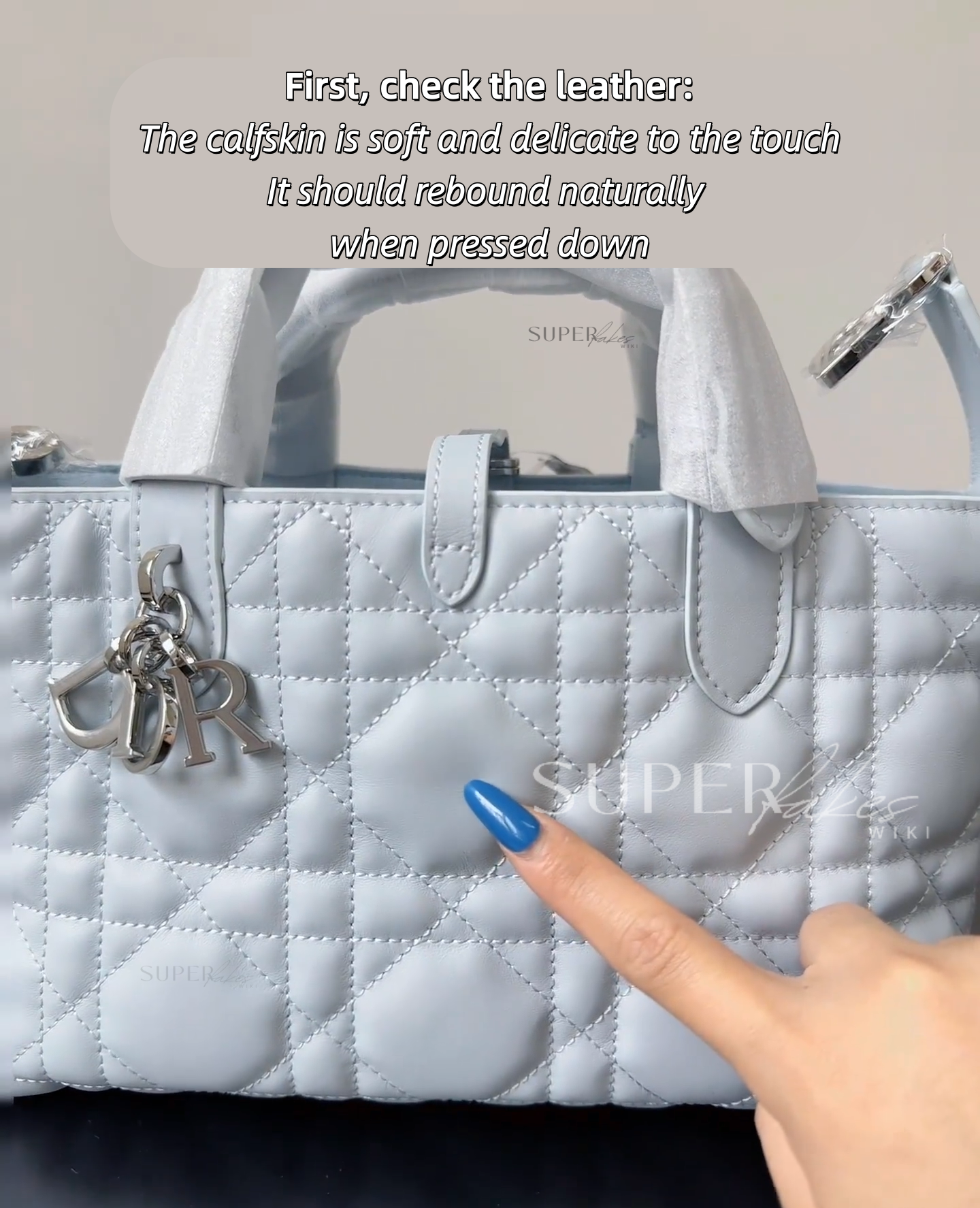
- The Test: Press your thumb firmly into the leather.
- The Reality: Real calfskin creates fine, natural radiating wrinkles and bounces back immediately the moment you lift your finger. Fake versions usually use heavily coated leather or high-grade PU—when you press down, it either feels stiff and plasticky, or the dent lingers like cheap memory foam.
2. The Hardware "Glaze" 🧵
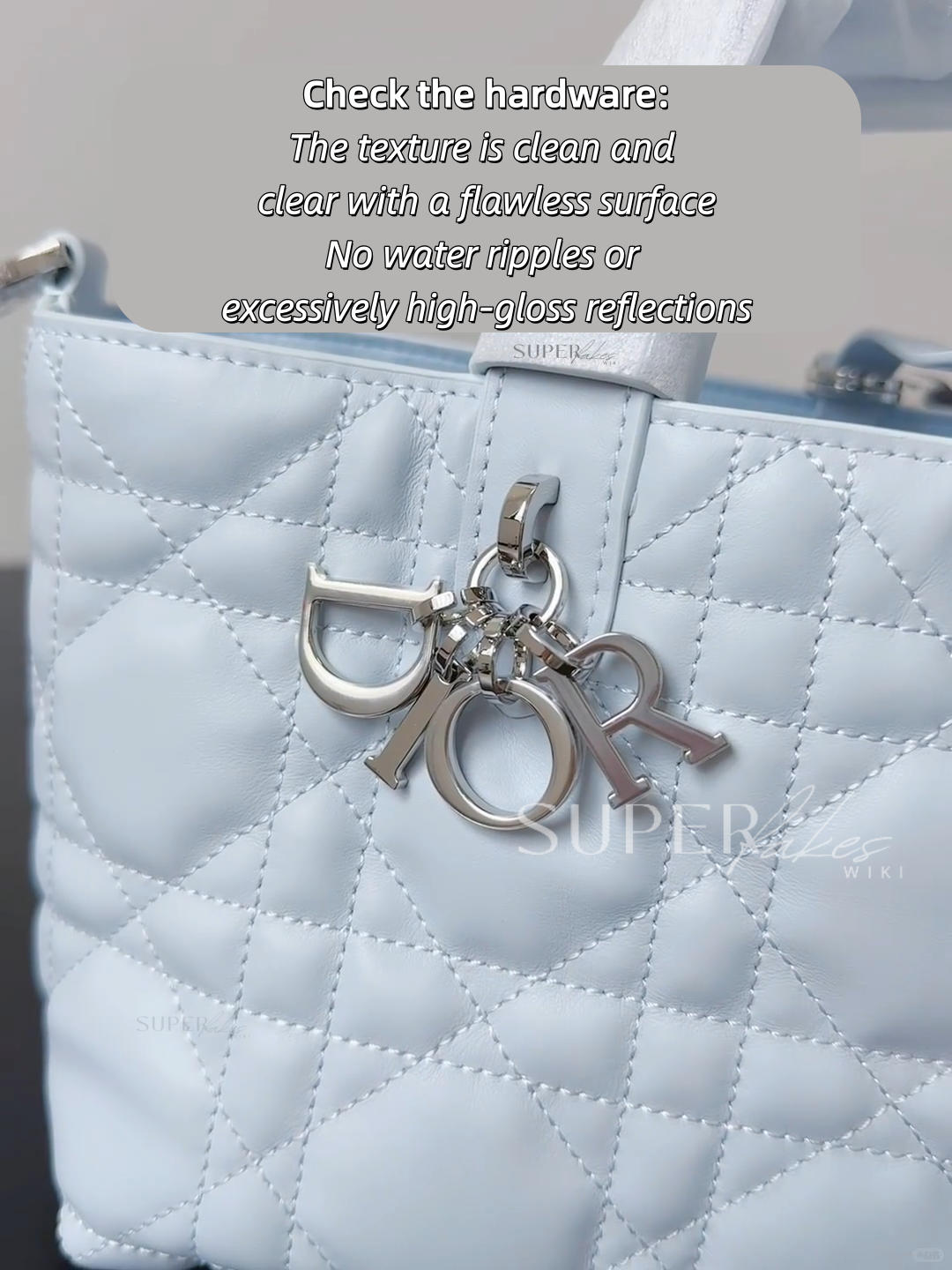
Cheap hardware is always too shiny. Counterfeiters love high-gloss finishes because they think "shiny equals luxury." It doesn't.
- What to look for: Look at the charms and buckles under direct light.
- The Reality: Authentic Dior hardware has a deep, slightly muted, liquid-like clarity. If the metal looks like a funhouse mirror, has tiny microscopic ripples (water waves) in the plating, or throws back a harsh, blinding glare, it’s a pass.
3. The Hot Stamping (The Real Dealbreaker) 🔍
The gold embossed logo inside the bag is where 95% of replicas fail. It requires a specific temperature and pressure that rushed factory lines just can't replicate.
- The Feel: Run your fingertip over the gold lettering. It should feel subtly debossed into the leather—not just printed on top.
- The Look: Authentic stamping has a refined metallic texture that shifts slightly from bright gold to a deeper hue depending on your angle. Fakes usually look like flat yellow paint stamped on by a machine.
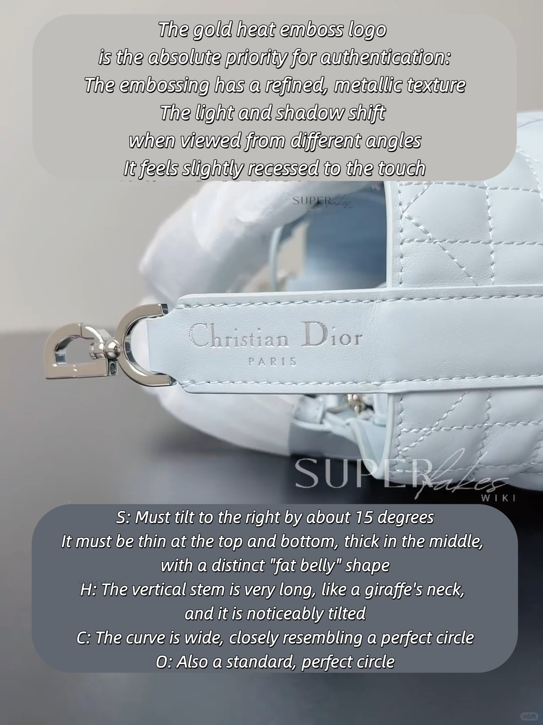
4. The Font Blueprint: S, H, C, O 📐
Dior uses a highly specific, customized typography. The replica factories usually just pick a close-enough standard font. Check these four letters carefully:
- S: The "S" must tilt to the right at roughly a 15-degree angle. More importantly, the top and bottom curves are thin, while the middle section is thick. It has a very distinct, noticeable "belly."
- H: The vertical left bar is normal, but that right vertical stem? It’s long. It stretches up like a giraffe's neck, and it carries a slight tilt.
- C: This isn't an oval. The curvature is wide and open, forming an almost mathematically perfect circle.
- O: Just like the C, the "O" is a wide, symmetrical, perfect circle—not a squished egg shape.
If the font looks standard and the leather doesn't breathe, you're looking at a fake.
When you are dealing with top-tier manufacturing like God Factory, you aren't just paying for a bag—you are paying for the exact 15-degree font tilt, the correct metal clarity, and the structural memory of premium calfskin. Budget batches simply cannot replicate these micro-details without destroying their profit margins. Stop overpaying for low-grade 'budget' iterations that scream fake from a mile away.
#DiorToujours #LuxuryAuthentication #BagSpotted