

The Real Chanel Serial Guide: 1986 to Metal Plates

Let’s clear up the confusion around Chanel serial stickers. Most online guides make you think every vintage bag follows a rigid template. They don't. Here is how the factory actually shifted its production over 30 years.
1986–1988 | The Six-Digit Era
The system was incredibly basic during the late 80s.
- Layout: 6-digit codes.
- Build: A simple white strip covered with clear protective tape.
- Font: Numbers were visibly wide and squat.
1989–1994 | The Seven-Digit Pivot
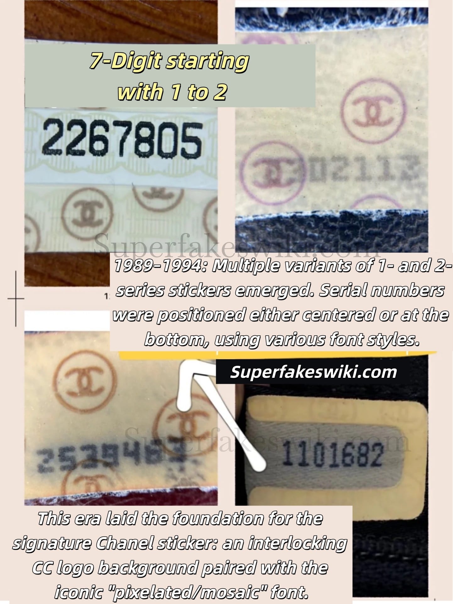
This is where most amateur authenticators get confused because the factory used multiple formats simultaneously.
- 0-Prefix: Fonts shifted, becoming taller and narrower. The interlocking CC logo made its first appearance in the background.
- 1 to 2-Prefix: Complete variation. You will find codes printed dead center on some bags and shifted to the bottom on others.
- The Shift: This specific window established the pixelated mosaic font as the brand standard.
1994–1999 | The Variant Era
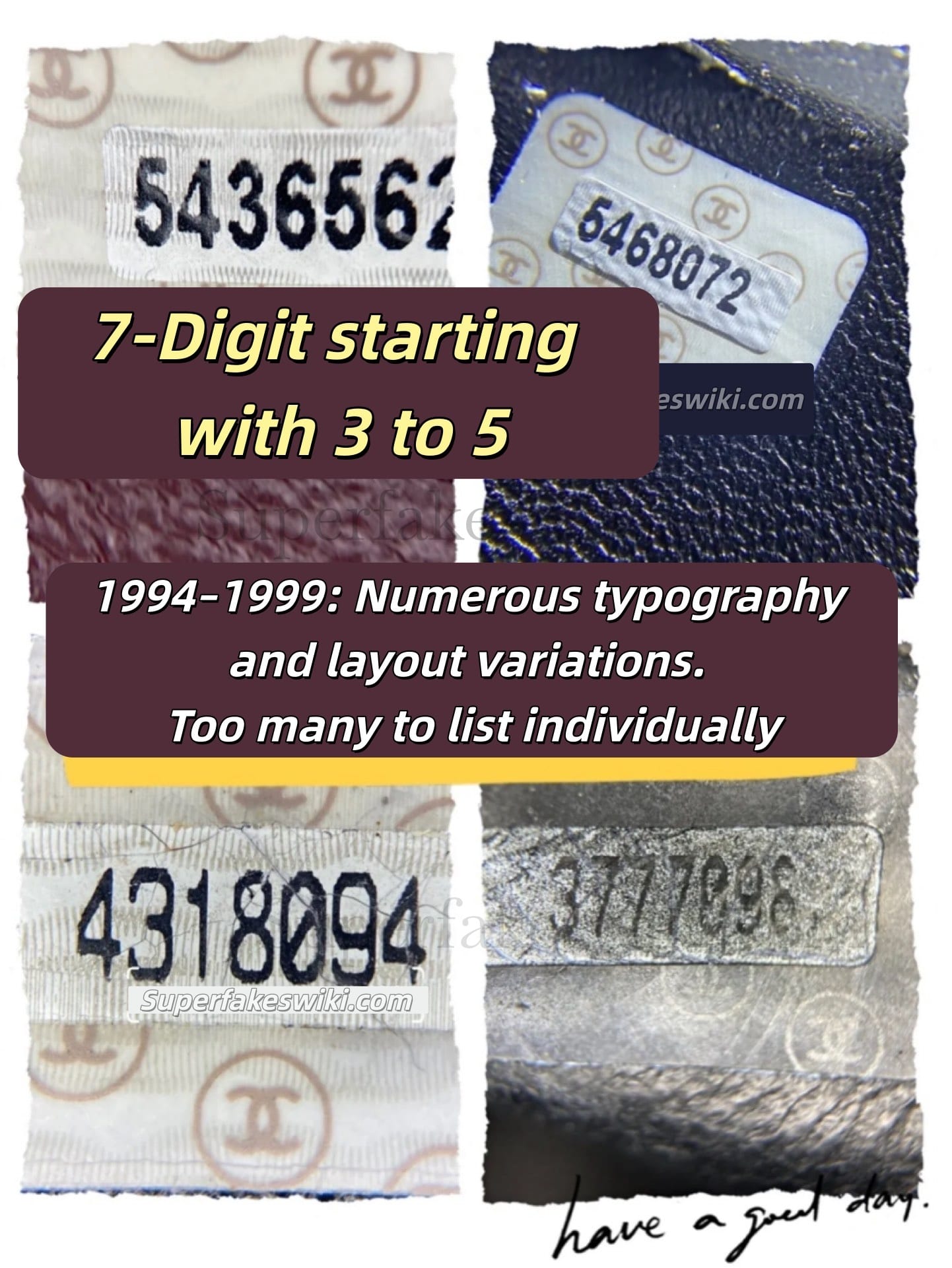
- 3 to 5-Prefix: The factory went through dozens of text formatting and alignment shifts. Do not expect total uniformity across these years.
2000–2021 | The Modern Upgrade
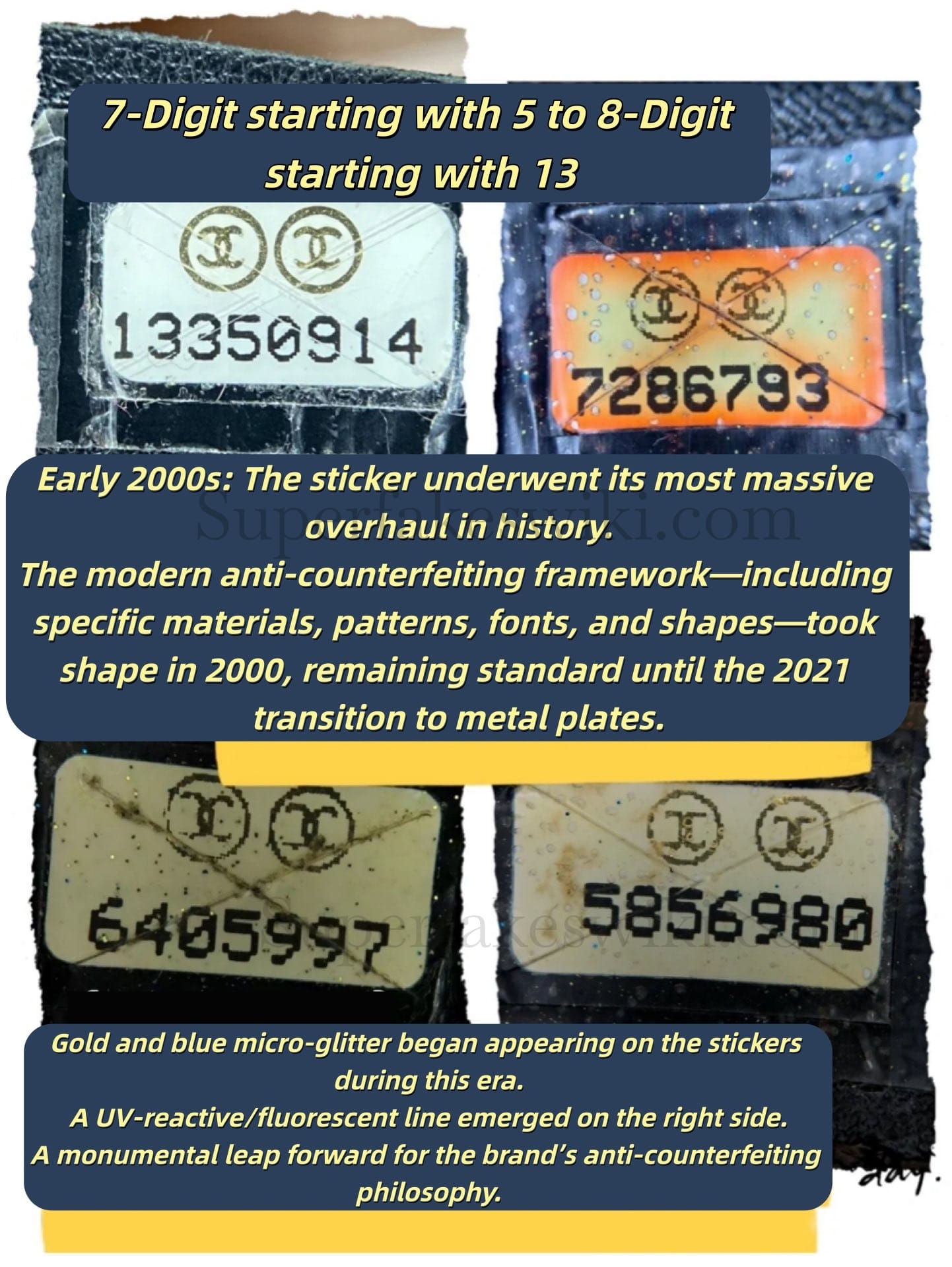
- 8-Digit Codes: Starting at the 5-prefix and running up to 13-prefix and beyond. This was the first major overhaul introducing explicit anti-counterfeit shapes, upgraded materials, and consistent geometric patterns.
2021–Present | The Metal Plate Age
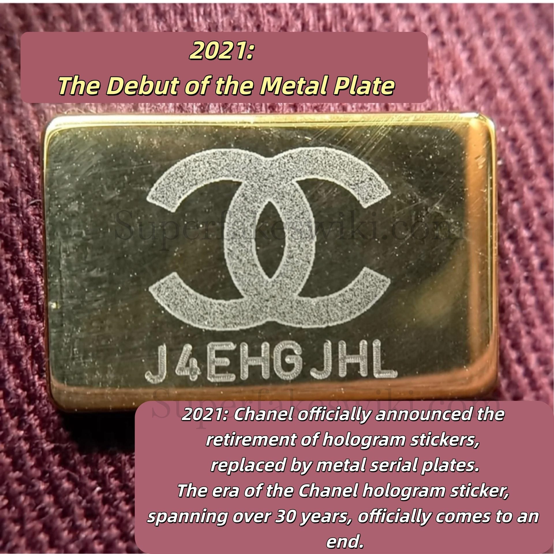
- In early 2021, Chanel officially announced it would phase out hologram stickers in favor of the all-new metal serial plates for authentication. With this move, the hologram sticker exited the stage of history. Accompanying the brand for over 30 years—from the moment Karl Lagerfeld took the helm until after his passing—the iconic sticker has engraved its own monumental legacy in the history of fashion.
Batch variations between 1989 and 1999 are a massive trap for buyers. Standard retail-level guides claim that off-center alignment means a bag is fake. In reality, factory shifts during those years caused labels to drift naturally.
Verdict
- Pre-2000 bags: Check the font structure, not just the position.
- 2021+ bags: Look for the clean metal execution. Flawless.
Next time: We’ll put the rep factory metal microchips under the magnifying glass. Let’s see who actually nails the fonts, edges, and laser-engraving—and who fails completely. Stay tuned.
![[Review]God Factory Chanel CF Medium: Is it the ultimate 1:1?](/content/images/size/w750/2026/05/gf_cf_medium-review.jpg)